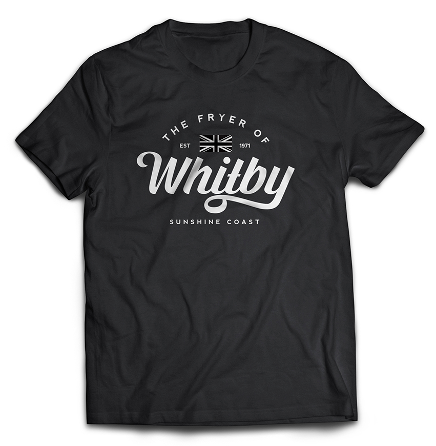
IT’S TIME TO CHANGE NAMES
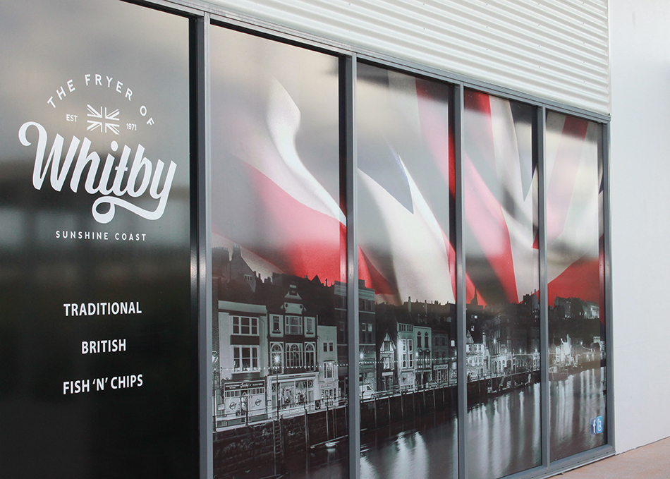
The owners were exiting out of a franchise and want a fresh new look for their Traditional British Fish n Chip shop on the Sunshine Coast in Queensland. Originally from a town called Whitby in the UK, the brief for Seek&Design was simple. Create a brand with a modern look, it must scream British Fish ‘n’ Chip shop and not your typically Aussie Take-a-way.
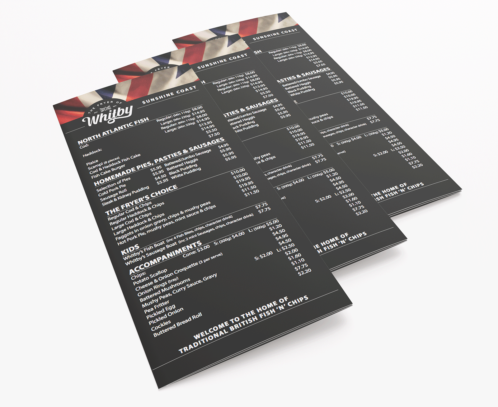
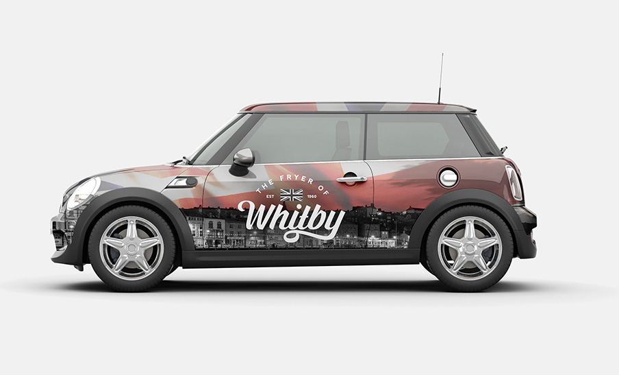
So the Fryer of Whitby was born. Using black & white imagery of the amazing seaside town of Whitby, contrasted against the red, white and blue of the Union Jack, Seek&Design created bold hero images that were used across the brand. The new brand extended throughout the exterior and interior of the shop with full length windows, backlit panels, posters, new uniforms, menu boards and take-a-way menus.
